The Mystery of Typefaces Instructor, Anthony Palmer
(FILE NAME)
Alphabet Posters
(COURSE)
Type Forms
(INSTRUCTOR)
Anthony Palmer
(SEMESTER)
Fall 2020
(CATEGORIES)
Typography
Visual Design
(DELIVERABLES)
Posters of three typefaces
(OBJECTIVE)
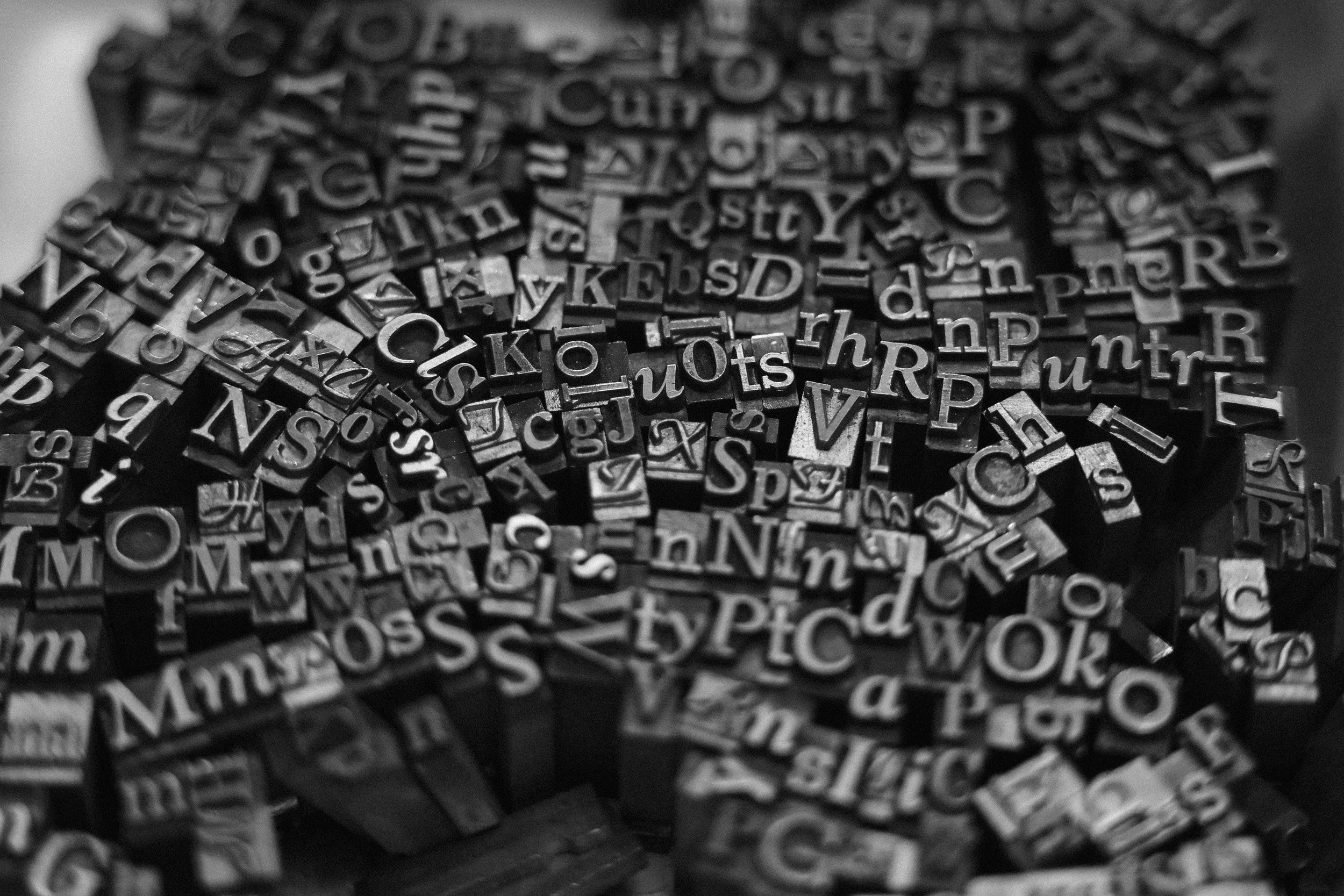
To create a series of alphabet posters that highlight the foundational role of typography in design, using diverse typefaces and layouts to enhance letter recognition and phonetic awareness. Each poster promotes visual communication and engages early learners in an inspiring design-focused environment.
(APPROACH)
I selected three fonts for the poster—Avenir, Bodoni, and Garamond—each representing a distinct typographic category: Geometric, Didone, and Garald. To enhance visual contrast, I used an asymmetrical layout and high-hue colors, allowing each font’s subtle characteristics to stand out against the black background. In addition, I added an italic outline to the headline text, which allows the audience to see the contrast between the regular and italic fonts.
